source: http://materializecss.com
Materialize is a CSS framework creating by Google in order to “provide familiar visual cues” using “components such as grids, typography, color and imagery” for “a sense of hierarchy, meaning and focus”.
#1. CSS
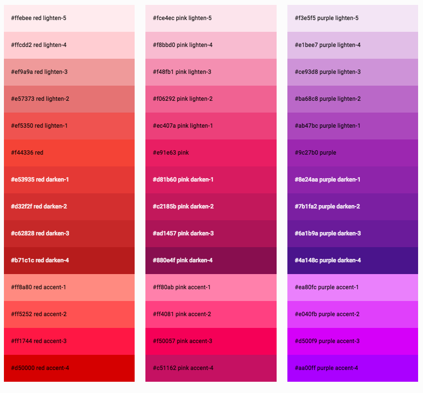
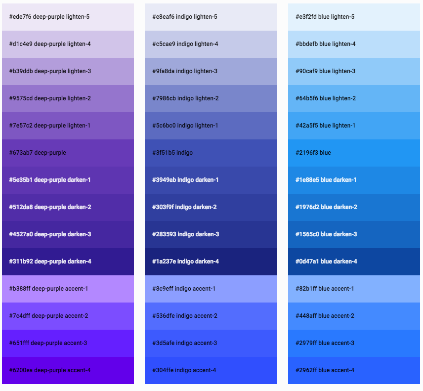
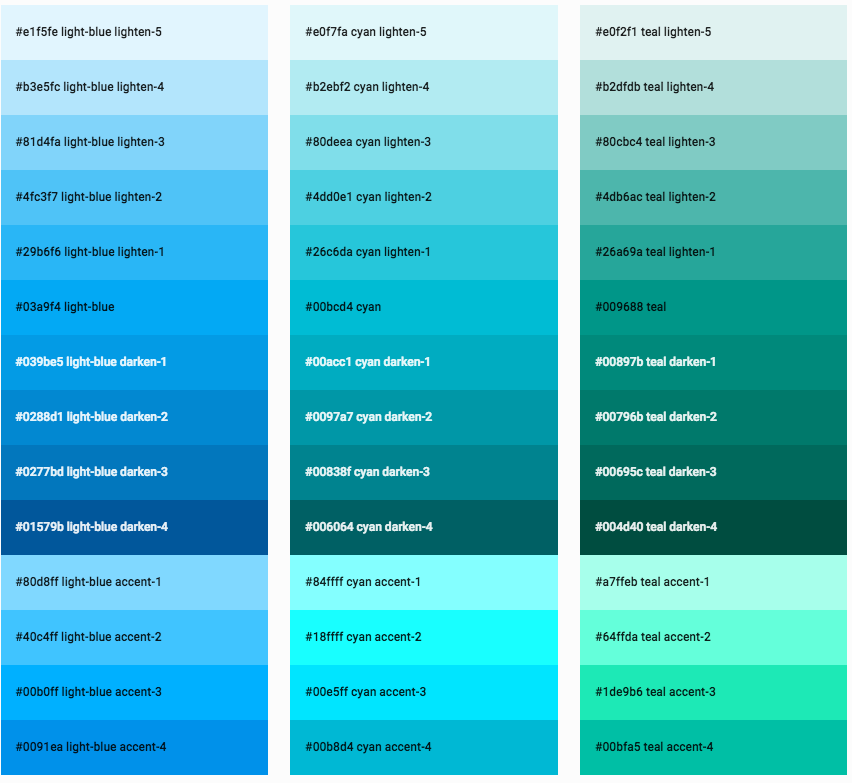
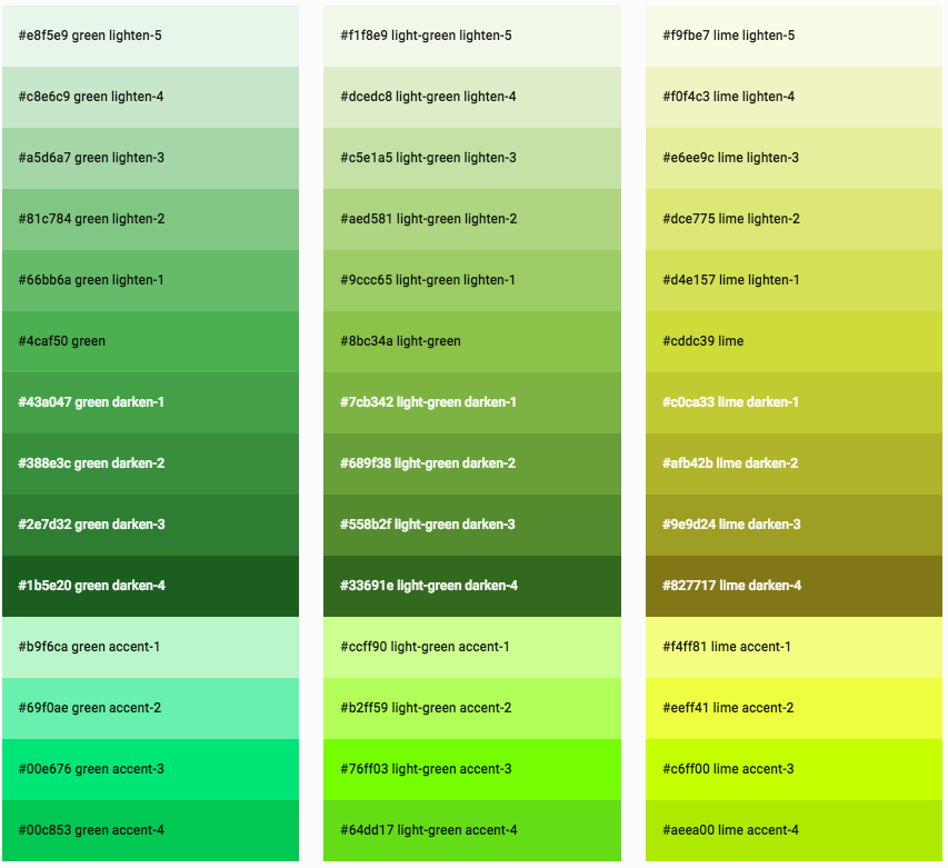
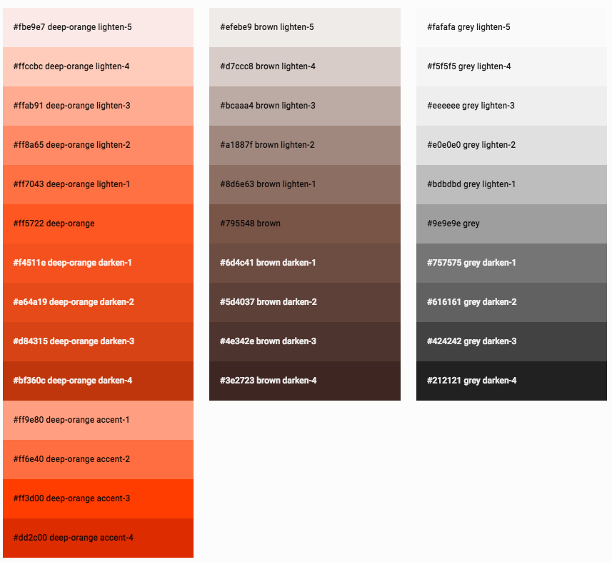
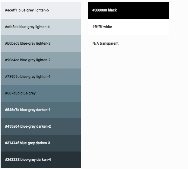
COLOR
To apply a background color, just add the color name and light/darkness as a class to the element
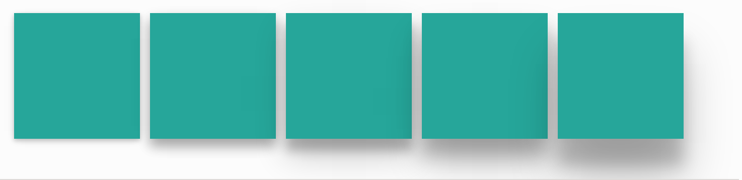
<div class="card-panel teal lighten-2">This is a card panel with a teal lighten-2 class</div>
To apply a text color, just append -text to the color class <div class="card-panel"> This is a card panel with dark blue text </div>
Extend the default classes using SCSS .ilike-blue-container { @extend .blue, .lighten-4; }

GRID
- standard 12 column fluid responsive grid system
- .container class is centered and ~70% of the window width
- .row classes contain .col classes
- .col classes have additional classes to specify a screen category and the number of columns (out of 12) to take up
- e.g. “col s12” takes up 12 cols on small+ screens (all screens)
- “col s12 m6” takes up 12 cols on small screens (mobile) and 6 cols on screens > small
- .section classes have vertical padding and are meant for organizing large sections of content
- .divider creates a full-width horizontal line for visual separation of content
HELPERS
- .valign-wrapper to hold vertically-aligned .valign elements
- .left-align .right-align and .center-align for text
- .left and .right for floating
-
.hide, .{hide show}-on-{small med large}-only, .{hide show}-on-{med-and-down med-and-up} - .truncate automatically truncates text and appends an ellipsis
MEDIA
- .responsive-img to make images resize responsively
- .circle for circular images
- .video-container holds responsive video embeds
- .no-controls.video-container for videos w/o controls
- .responsive-video on video elems to make them responsive
SASS
- change color scheme in _variables.scss
-
@media #{ “$small $medium $large”-and-“up down” } e.g. @media #{$small-and-down} - @include transition(.3s) will output:
- -webkit-transition: 0.3s;
- -moz-transition: 0.3s;
- -o-transition: 0.3s;
- -ms-transition: 0.3s;
- transition: 0.3s;
+ - View all mixins
- animation($args)
- animation-delay($delay)
- animation-direction($direction)
- animation-duration($duration)
- animation-fill-mode($mode)
- animation-iteration-count($count)
- animation-name($name)
- animation-play-state($state)
- animation-timing-function($function)
- background-size($args)
- border-radius($args)
- box-shadow($args)</br> - inner-shadow($args)
- box-sizing($args)</br> - border-box()</br> - content-box()
- columns($args)</br> - column-count($count)</br> - column-gap($gap)</br> - column-rule($args)</br> - column-width($width)
- gradient($default,$start,$stop)</br> - linear-gradient-top($default,$color1,$stop1,$color2,$stop2,[$color3,$stop3,$color4,$stop4])</br> - linear-gradient-left($default,$color1,$stop1,$color2,$stop2,[$color3,$stop3,$color4,$stop4])
- opacity($factor)
- transform($args)</br> - transform-origin($args)</br> - transform-style($style)</br> - rotate($deg)</br> - scale($factor)</br> - translate($x,$y)</br> - translate3d($x,$y,$z)</br> - translateHardware($x,$y)
- text-shadow($args)
- transition($args)</br> - transition-delay($delay)</br> - transition-duration($duration)</br> - transition-property($property)</br> - transition-timing-function($function)
SHADOW
- In material design, everything should have a certain z-depth that determines how far raised or close to the page the element is
- .z-depth-2
- @extend .z-depth-2
TABLE
- tables are styled by default
- .bordered will add borders to a table
- .striped will add zebra stripes to the table
- .hoverable will add hover states to table rows
- .centered to center all cols
- .responsive-table will make the table horizontally scrollable on smaller devices
TYPOGRAPHY
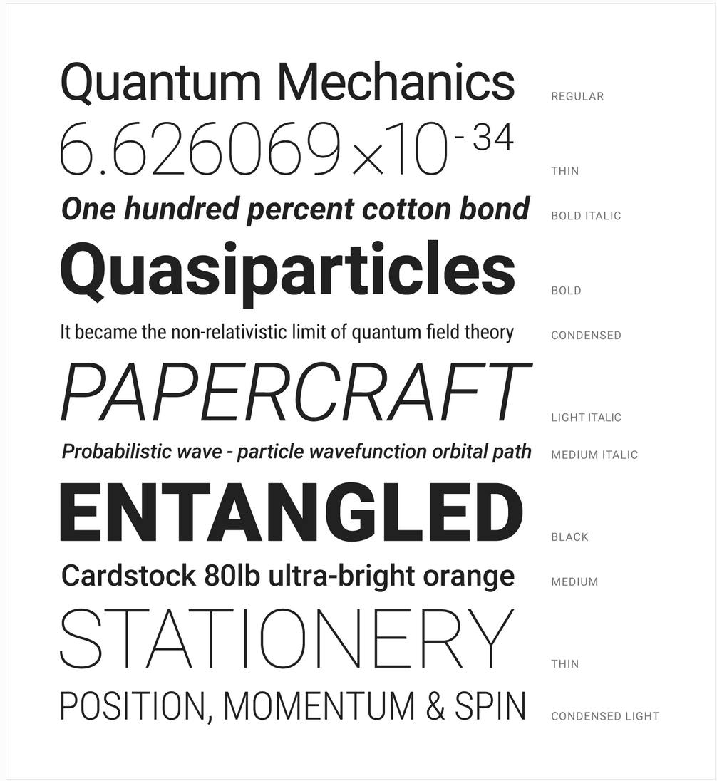
- Google Roboto is used by default
- Change the font stack by modifying “font-family” for the “html” element
- .flow-text containers resize their text based on screen size
#2. COMPONENTS
- Collections are list items
- Buttons have different states, sizes, positions, icons and flatness
- Cards:
- a convenient means of displaying content composed of different types of objects
- well-suited for presenting similar objects whose size or supported actions can vary considerably, like photos with captions of variable length
- different sizes
- image cards
- reveal cards
- Footer:
- sticky footer is supported
- the following css will provide a sticky footer, where the page is organized into 3 main elems, <body> <main> <footer>:
body { display: flex; min-height: 100vh; flex-direction: column; }
main { flex: 1 0 auto; }